The POS counter may be where most customers make their buying decisions, but it isn’t the only space that influences their experience or your ability to sell. Many customers wouldn’t have stepped foot in the store without the allure of your displays. The key is understanding the core elements of a good store display.
Starting Your Store Display
Always begin by cleaning out the display area. Make sure no dust and debris is left behind and clean both sides of windows (if any are present). Then you can place the largest items first. These will take up the most space so adding them in before anything else will allow you to build around them. Set up the remaining items the same way, with the bigger merchandise first.
Store Display Balance and Color
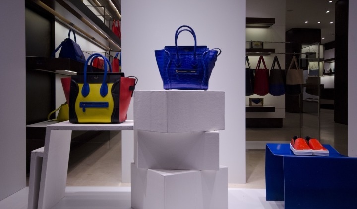
Balance and color are very important because they attract the eye and set the tone for the display. Asymmetrical balance is usually ideal for retail displays but you can experiment with the space you have to figure out which approach will get the best results.
While balance will help guide the eye, color sets the mood. Retailers have been using color to illicit a response from customers for years. Red is often used by restaurants because it is associated with hunger. It’s also popular among relationship and intimacy related products because it also signifies love. Black is considered bold and rich, making it one of the colors often used to sell luxury items. Other common colors include:
- Blue - Creates feelings of trust and stability and is often used by banks and professionals
- Green – Viewed as soothing and earthy, frequently used to sell eco-friendly and organic products
- Yellow – Creates cheerful feelings and is associated with high energy and youthfulness
- Orange – Healthy and attention-grabbing, orange is often used to stand out
- Pink – A feminine hue that’s often seen as sensitive, caring, emotional and sometimes sexual
- Purple – Considered regal and luxurious, purple is also viewed as mysterious and creative
Focus Attention Where You Want It
Your display should guide the shopper’s eye where you want it to go. This is a two part process. First, make sure your layout focuses on a certain space. This can be enhanced by using signs, props and the background to help direct attention to the key product(s) or area. Next you can add accent lighting to further enhance your focal point. These areas should be made the brightest and most visible.

Keep Your Store Display Simple
Make sure you aren’t over doing it when building your store display. Retailers want to get the most out of every inch of display space, but that doesn’t mean cramming in as much merchandise as possible. It means using the space effectively, and that includes leaving a little breathing room. Too many items, props and signage can make the display look too busy and may actually repel customers who won’t want to spend precious time figuring out what you're trying to convey.
A good way to avoid a complex display is to sketch the arrangement on paper before you start. This will allow you to have a plan in place so you know exactly where to start and stop to keep it simple yet effective. As long as you adhere to these guidelines and keep your store displays unique and relevant, you can dramatically increase sales by enticing more customers to stop in and have a look!
